While first impressions are not all that matters, it can still affect how people perceive a business. In fact, potential customers start judging an establishment even before they set foot in the building.
You see, curb appeal doesn’t just help real estate agents sell houses; it is also crucial in making consumers remember and remain loyal to a particular company or brand.
Want to know what you can do to boost your office’s exterior appearance? Here are some useful pointers for picking out the best exterior paint colors for a commercial building that could help:
Consider Brand Consistency
Anything and everything related to your company can affect your brand image, and that includes how your place of business looks like. That said, the first thing you must consider when picking a commercial paint color is your brand.
All brands have a unique color palette or swatch that is purposefully chosen to reflect a company’s vision, values, and goals. Consistency is crucial in branding, so you have to ensure that the building complements your brand.
Talk to your marketing team about selecting colors from your color palette. They should be able to offer sound recommendations that will ensure brand recall.
Analyze Your Target Audience’s Color Response
Besides your company’s brand and the message it conveys, you also need to consider how well the colors can reach your target market.
Different audiences respond to varying colors, so make sure you do thorough research on your target audience before picking out paint. For instance, muted tones appeal better for older generations, while bold ones are most suited for younger people.
You can also consult exterior paint experts and contractors about the current color trends for commercial buildings.
Go for Functional
In terms of functionality, the color of your office building has more uses beyond marketing. This means that your color decision can also improve certain aspects of the building.
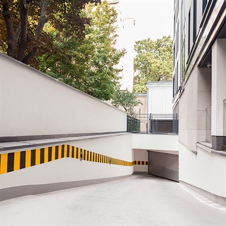
For instance, lighter hues reflect sunlight and reduce heating and cooling costs. You can also use bold colors for certain architectural features like doors and trims for that added pop of color that also makes the structure and its entryways more visible and easier to find.
Make Signage More Visible
As with entrances and other key parts of the building, certain paint colors also help make your company signage more visible. This allows customers to find your office faster from the road.
Don’t forget to steer clear of hues that are too bright (e.g., highlighter yellow). You wouldn’t want to be remembered as the company with the obnoxiously colored office building. Bright colors also divert people’s attention from your company signage and will leave them recalling that particular trait instead of your brand name and logo.
Assess the Architecture
Another crucial consideration when selecting paint colors is the architectural style of the structure. This will prevent you from using hues that don’t match the theme of the building.
For instance, older and more classically designed buildings look great with rich brown and neutral paint colors. On the other hand, modern structures favor bolder tones of yellow, orange, and red.
Aside from the style, you should also take into account the materials used for the building’s exterior. These will determine how the paint color will look when applied and how long it’ll stay that way.
Look at the Big Picture
Aside from the building itself, you must also consider the rest of the area. You’ll want to minimize certain aspects working against the vibe you want while highlighting those that help you achieve it.
For example, a small space would feel a bit airier, cooler, and bigger with pale paint. Meanwhile, you can achieve a more inviting and cozier ambiance even with an oversized lot by using darker, warmer, and deeper colors.
Aside from this, below are a few other considerations you need to think about:
- Landscaping – Is it verdant and colorful throughout the year?
- Weather – Does it snow where the building is located?
- Neighboring structures – What color are the parking lots, driveways, walkways, and surrounding buildings
Consider Color Combinations
Who says you need to choose only one color for your commercial space?
Combining the right hues makes for aesthetically pleasing projects, so be sure to use color theory to narrow down your choices.
Follow the 60/30/10 rule, which entails having a maximum of three colors for the building’s exterior, one for each of the following:
- Walls
- Trimmings
- Accents
The color wheel can help you choose good color combinations. There, you’ll find two primary types of color matches:
Analogous
This consists of colors sitting beside each other on the color wheel. Some examples are yellow and orange, and purple and pink. Analogous colors lend a subtle but harmonious effect on a space, making it feel more casual.
Complementary
Complementary colors are those located directly opposite each other. Examples include blue and orange, purple and yellow, and red and green. These are visually striking and leave a more impactful effect on any space.
Color Matters
Colors not only make a structure look great; they also have other purposes. Consider the pointers listed here when choosing the best paint color for your commercial building.
Coming up empty? Try looking for wall painting ideas online or visit our Equipaint showrooms to get inspiration for your commercial space.